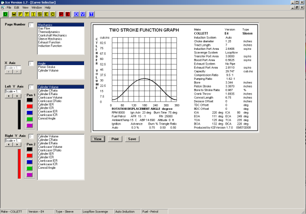
The image above shows the Curve Selector window, this is accessed either by clicking the ![]() button, or from the file menu. Graphical output is in A5 landscape format.
button, or from the file menu. Graphical output is in A5 landscape format.
Before using the curve selector (![]() ) you must have clicked one of the yellow or red buttons - once clicked the
) you must have clicked one of the yellow or red buttons - once clicked the ![]() button will be activated.
button will be activated.
When the window is opened you will be presented with a set of options based on the last button pressed; all options will be available if a red button has been pressed, some options will not be available if the only button pressed was yellow.
One of the items in the top list (Page) will be selected; each option corresponds to a yellow or red button.
The X-axis will have an option selected.
The first (left) Y-axis will have an option selected - usually the first item in the list. Nothing will be selected for the second (right) Y-axis.
Selecting a new item in the top list (Page) will change the contents of the Y-axis lists (the left and right lists are identical). The Y-axis lists are tailored to the selected Page.
To produce a graph click the button labelled View.
The ICE program will select an appropriate plotting scale to suit the size of the engine and the type of data to be plotted. You may change the scale using the left and right arrows under the scale box by the axis labels; a range of 0.1 to 5 (10% to 500%) may be applied. Each Y-axis may be adjusted, but be careful of distorting comparisons by having different scales. Changing the scale factor does not affect the origin - only the upper limit. For the graph shown above the X-axis would still start at zero degrees and the Y-axis would still start at zero cubic inches.
By default the left Y-axis will plot in black and the right in red. A choice of five colours are available for each Y-axis. To change the colour click on one of the colour boxes adjacent to the required axis.
As an example of how to produce a graph the following shows the creation of a PV diagram.
First you should be aware that the PV diagram will be based on the RPM of the last run; that is the maximum RPM.
The screen below shows the first stage.
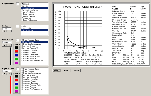
The Page selected is Thermodynamics. The X-axis is Cylinder Volume. The left axis selected is Cylinder Pressure. All other items are left to default. Don't be tempted to change the scales yet.
Click the button labelled View to display the graph.
The graph window contains the plot, the engine data, some of the calculated data, and the RPM on which the data is based. If you need to change any of the settings, close the window and re-run the case with modified settings - then reopen the Curve Selector and start again.
Notice that todays date is at the bottom right-hand corner of the graph.
The image below shows stage two of producing a PV diagram.
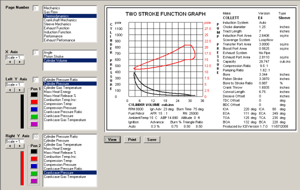
Crankcase Pressure has been selected for the right Y-axis. The default colour red has been used.
Notice that the left and right Y-axis scales in the graph are different; both are psia (pressure), but the Crankcase pressure uses a smaller range than the Cylinder. ICE has selected them with a PV diagram in mind.
Apart from the red text on the right Y-axis, the text will be unchanged by adding a second Y axis.
The image below shows the third and final stage.
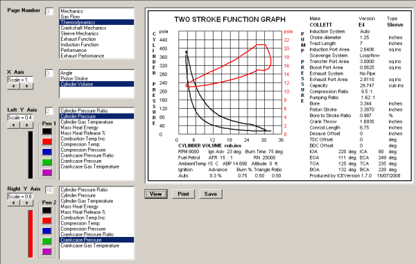
The scales have been modified so that the graph fills the plotting area. The X-axis is unchanged. The Left Y-axis have been changed to 0.4, the right to 0.8.
Click the button labeled View to display the graph.
The graph may be saved using the button labelled Save. The file saved is in standard Window's bitmap format, and so may be imported into many other programs.
The graph may be printed using the button labelled Print.
It is possible to plot a graph that has clipped the data (valid data has been plotted outside the graph area). The image below shows this. Notice that the save and print buttons have been disabled.
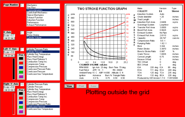
There is obviously something wrong - a red background and the Plotting outside the grid message.
Looking at the X-axis scale will show the cause of the problem - it is set to 0.7. The graph has the right side truncated.
In some cases the data may be plotted entirely outside the plotting area - changing the scale to the maximum (5) for all axis is a good place to start solving the problem. If the problem persists then looking at the RMP range (reducing the maximum) may offer a solution.